Showing posts with label Color Inspiration. Show all posts

Confessions of a decorator: Taking Risks & our navy blue master bedroom

Thursday, October 16, 2014

This is a true story, about someone who can walk into a room and make design decisions for anyone else without second thought.
Eh ehmm.
I can pretty much tell you what a room needs to have changed and added to make it feel complete & beautiful.

But, then I get to my house and I kinda freeze up.
It's the weirdest thing. I've literally been debating on a bedroom color for our master for a year.
A YEAR. I mean really. Why was it so scary to me?
Probably because I was really set on changing the feel completely to something completely against today's design grain. 
Everyone out there is all like, "Paint all the things white!" And I'm over here like, "I just need something saturated in my life!"
I like white, light, airy.. but color is not a bad thing either.
I have been LOVING all the navy blue accents that are starting to show up in the home accessory world. I knew I wanted navy blue in my house, and something more than an end table or a vase.

Then there was the part that nearly EVERYONE who saw the patch sample of deep navy on my wall nearly freaked out. 
What if it was a cave.
What if I hated it.
What if I ever wanted to change the color.
What if it took 5 bajillion coats of primer to cover my DARK PERMANENT mistake!
What if a future buyer of my house HATES it.
Let me tell you, that future, nonexistent, made-up, home buyer was the one who stopped me dead in my tracks the most.
I mean this isn't our forever house, so I'll have to sell it someday


Then I thought really, how dumb! Just do it Jenna! 
So I did. And I am SO thrilled with the color. It is the perfect shade of Navy. It has a LOT of pretty grey tones to it so it's not too "blue" if you know what I mean.


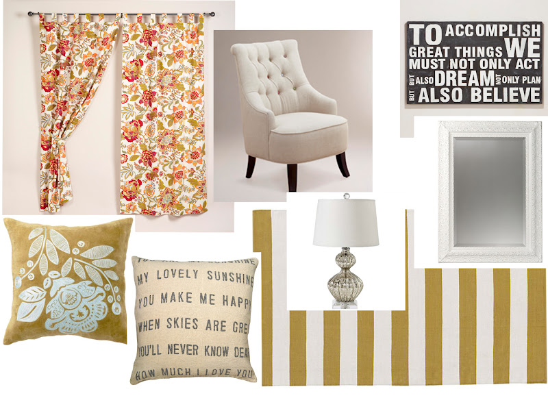
I pretty much have all the bedding I've been considering on the bed in these pictures. Of course it's TOO busy but it's all part of the process.
Rooms don't just pop out pretty like I think the blog world leads people to believe.

Of course the duvet will get filled with an insert if I permit it to stay. And maybe even some pretty trim added onto it.
It's all part of the process. I've been living with these linens just to see how I REALLY like them. Ya know what I mean?


I've been gathering pretty things for the walls and I am about done I just need to make some artwork for the walls. And edit the bedding selection.
I can't wait to show you how this space ends up.

So  moral of the story is sometimes you need to stop second guessing yourself, and take that risk in your house to make you completely happy. Not everything is about resale. And sometimes you know better than the current trending colors. Break that mold & just do it! 

The paint color is Relaxed Navy by Valspar.


A classic & fresh master bathroom.

Wednesday, September 17, 2014
Our home has a lot of great things about it, and we have been slowly making it our own. 
Lately, the bathrooms have been on my mind because they remain pretty builder grade and boring. Before I start any project, especially large scale and pricey I like to research products and figure out what is out there.
I found a great website called Modern Bath. On their website they pretty much have everything you could dream up for a Kitchen or Bathroom redesign. It was a lot of fun looking through their website and put together pieces I would love in our own master bathroom.

I don't really like a lot going on in bathrooms, I think they should always feel fresh and clean.
So a light & crisp color palette is very important in my world.
I love fresh mixed with classics, all the hardware I chose are very classic and pretty.
I've been dying over these widespread style faucets that are all the rage right now. Even if they weren't trendy I would still love them because their nod to vintage, farmhouse style, and classic charm.
Best of all worlds? I think I found it... in a faucet.


Sources:

Pops of color: Green.

Thursday, April 18, 2013
I've been really into color lately, which is weird because I am such a neutral lover at heart. I've been trying to not go so crazy in fear that it's the hormones making me want color color everywhere. I thought I would start sharing with you some spaces that get the pop of color in a room done just right. 

Today I'm sharing some of my favorite ways to pop in a dose of green. I've always loved emerald, hello May is my birthday! It's my birthstone. It's never been a trendy color though, which always made me sad. I was thrilled when Pantone named it the color of the year. Finally my beautiful birthstone could be given justice for how beautiful it is! 

Here are some of my favorite pops of green inspiration photos. 

I love tufted velvet headboards[in any color... really] but done in this bright green is a total show stopper! They can be really high glam, so I love the mix with the eclectic vintage linens on the beds is the perfect pairing.


I love a pop of color, Emily did it so well choosing to paint her back door in a great shade of green. Adding an unexpected element to your home is what it's all about! 


I love how fresh this space is with just some beautiful green [I'm guessing silk] curtains with the same color repeated in the vintage botanical prints.


What do you think about adding some green to your home? I absolutely love how fresh it is, it can wake up a whole space.

Classic boy [navy blue & orange] nursery.

Friday, March 1, 2013
I've been asked, or rather told that it is "so hard" to put together little boy rooms. So I thought I'd share a little inspiration board of things I'm mulling over for my very own boy nursery
[still so surreal... there's going to be a little boy running around here?! strange!]

I'm already 23 weeks, more than half way done so I guess it's time I get some solid ideas on a nursery for this little man.


Sources:
Gulliver Crib from Ikea
Rug from Urban Outfitters
Crib bedding from Pottery Barn Kids
Upholstered Chair from Ikea
"I'll eat you up, I love you so" Print from Olive and Birch on Etsy
Chevron Pillows from Motion52 on Etsy
Drum light from Home Depot
Vintage dresser for changing table
Vintage wood crates on castors for storage

Sorry I haven't been around the blog world lately. Interior design school tried to eat me alive last month... it partially succeeded which is why I haven't posted in so long. I would say I will get better... but no promises. I decided to take really time consuming classes the semester that I was pregnant... awesome idea I know!

 I am really excited about putting this little guy's room together though! &even more excited for baby boy to be here already [far too soon for this talk I know.]

Linked up at Inspire Me Please Linky party.


A big girl room for Gracieloo.

Thursday, October 18, 2012
My baby is almost 2! With the number of times that girl has climbed out of bed... a big girl room has definitely been on my mind! 
I'm afraid / in denial of her needing a real bed, and all that junk. 
I mean seriously, wasn't she just born?
Ok- done with my mom rant. 

I am a fan of making a girl room SUPER girly, especially if that matches who your child is. I mean Grace is SO that girl. A classic beauty, if I do say so myself. 

I love this color paint by Benjamin Moore. It's saturated, and can read coral depending on what you pair it with. Love it with LOTS of white & light accents. It's fresh, and I think it will grow with her. T-minus 5 months till we buy our house & I can paint! 

I really want to find a Jenny Lind style bed, but they are SO expensive/nonexistant to find one used. So I might go something more french provincial. 

I love this bedding from Rachel Ashwell's line at Target. 

I have been wanting to do this idea from Dear Lillie for a while now. It's so whimsical & fun for kids.

Grace already has a really pretty dresser that I redid for her, some fun knobs are a necessity for a little girl. These ones are from Anthropologie.

I love this I am a Child of God print from Persimmon and Pink. She's closing her shop, BOO! So that means you need to order this month! 

Every little girl's room needs a chandelier. Well if you live in AZ it needs a ceiling fan, but I really love this one from Ikea, love the price too! 

The artwork & rug are from Pottery Barn Kids. But-- I'm thinking about having Grace help me do a water color painting with all the colors of the room to really pull it all together. 


FAQ: Matching & Coordination.

Monday, September 24, 2012
I have been getting A LOT of questions from readers about how to coordinate fabrics and textiles for a room. And how do I know if they match? Actually, it is probably the first thing a client says to me when I walk in their door. "I don't know how to make things match." So I thought I would address the 2 questions I hear the most out of them all. 

WELL. 

I could come up with some super technical answer for you that would confuse the heck out of anyone who hasn't taken design classes OR I could just give you some examples of making things coordinate even though they are not the same exact color or print.

1. Coordinating prints: I get asked this ALL the time. I don't know why people have such a strong case of mal-selfesteem when it comes to putting prints together. But it seems they do. A good rule of thumb is that you can have 1 geometric, 1 exploded print, and 1 mini print.

Source: bhg.com via Jenna on Pinterest
Stripe rug, large floral, mini print.

Large print, smaller print, and geometric rug.

Source: archzine.org via Jenna on Pinterest


2. Matching Colors: "I really like [fill in the blank color] but I don't know what I would put with it." My favorite way to do color is just bringing in a plethora of different tones of 1 color. Which also brings depth and warmth. By doing it that way, whatever color you have chosen kind of turns into a neutral of sorts, and as the seasons change your pop of color that you bring in to contrast can too.


Source: weheartit.com via Jenna on Pinterest


I hope that helps, as always if you have any questions you can always shoot me a comment or email! 


Inspiration: A formal front room.

Thursday, August 30, 2012
Things have been a little bit more than insane around here lately. We have been frantically trying to make our minds up about where to live and school and my husbands crazy work schedule lately. It's been a whole lot on our plates. Don't worry, I'll be at least a little more frequent with my posts as soon as things settle.

Anyways, taking a step back and on the terms of design lately. I thought I would share with you a little inspiration board I put together for a client for her front formal living room. It's such a silly room sometimes. I mean what REALLY is it for, besides the importance of making it pretty because that's what everyone sees when they first walk in the door to your home.
It's still silly.


Whitney's front room is really teeny in comparison to her grand house, so with the space being small, I wanted to be careful about how much dark and how much pattern I brought into the space. She really loves red, so with a dose of bright bold pattern paired with more subdued stripes and accent pieces it will totally work! 

Did I mention she has a REALLY cool old church pew that she is keeping in her seating arrangement, I almost died.


Elizabeth's front room.

Friday, August 24, 2012
I was contacted by Elizabeth to help her sort out her front formal living room. She ended up living down the street from me, how funny is that!
Anyways, her room was a blank slate with freshly painted walls and brand new flooring.

She really wanted something light & bright. Of which, I can totally relate! The first thing she showed me was her favorite color blue. She already had a few pieces with the blue in it, so I thought we could just incorporate it throughout the room.

Here is the inspiration board I came up with for her.
Elizabeth's Living Room
She has a dark brown leather sofa that she already owned that will be making an appearance in the room also, it will pair well with all the light touches I chose.
Light wispy drapery, pretty accent chairs, a couple pretty storage pieces, topped off with vintage accessories, and a few sparkly lamps.

When you're doing a cool color palette its always nice to throw in a warmer color like yellow, or coral to make the room feel more cozy and inviting.